Friday, 22 June 2018

EXPERIMENT 3 - SUBMISSION

The Dropbox link is shown below:

https://www.dropbox.com/sh/4skic7ipb25g9qb/AAAZBHyCSvAj3F3TbzpA7VCNa?dl=0

NOTE:
Inside the folder ARCH1101 Projects Folder, lumion scenes and sketchup model are located. Video of my final moving elements (lights and wind turbine for green energy) are also accesible via Dropbox. 


EXTERIOR


Mostly unadorned, the exterior exhibits the "viable" and "simplicity" of the design need in regards to the theory. It is simply a glass cage and has a roof overhead that is covered with the scalar texture to showcase the immobility of the building. Hence, the exterior demonstrates how a solution only seems weak at a glance when in reality, it has concrete evidence and concept that strengthens it.


The bridge is harmoniously attached to the open, sheltered area at the Squarehouse and upholds multiple geometrical shapes that are extruded to form the functional spaces of the school. This implies how complex mechanisms unify and conform to a some singularity to serve the final need, much like chemistry and physics.


INTERIOR


Laboratory

Computer Labs

Meeting Room

Workshop

Study Space


Library

Stairs - Outside
Gallery


The moving elements were chosen to unify the school with the whole university. Close-by is the Tyree building that uses green energy through solar panels. To follow the motto, "Never stand still", the library would be powered by the wind turbines on the side. Meanwhile, the entrance of the famous main walkway of UNSW is at the foot of the building. In an attempt to mimic this, the lights on either side of the bridge that only emerges at night to save power are incorporated into the building, hence forming an inter-relation between the School of Engineering and the rest of UNSW.

Tuesday, 19 June 2018

EXPERIMENT 3 - WEEK 4

36 Textures of Movement


Feedback to Ryan


Feedback for me


Sunday, 10 June 2018

EXPERIMENT 3 - WEEK 3

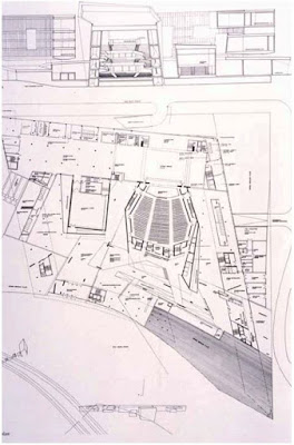
Inspiration from Zaha Hadid - Opera Hall


Interesting things:
- complex geometry
- distinct room arrangement
- rectilinear and curves both exist harmoniously

Problems:
- may not be simple to manipulate with incline
- need serious consideration of size, function and circulation

Plan Extrusion


I experimented with simple colours to augment my theory into reality. The views show different perspectives, close-up shot of the linkage between the bridge and the Squarehouse. Section of the building that was formed from extruding the plans in class is in plain view as the exterior will be a simple rectilinear encasing that hides this interior composed of multiple complex geometry.

I am planning also on adding curving elements for the roof and shelter of the bridge that extrudes out from the school of Engineering to the blockhouse.


Friday, 25 May 2018

Sunday, 6 May 2018

EXPERIMENT 3 - Week 1

Theory and One-Point Perspectives

The article which words for my theory is derived from:
Kennesaw State University. "Engineering researchers explore new concept to reduce traffic congestion." ScienceDaily, October 4, 2016. https://www.sciencedaily.com/releases/2016/10/161004111754.htm.

Theory:
"A viable solution reduces a concept's complexity, ensuring its simplicity."

Perspective Drawings:


1. Upper concept
2. Sideways and pulling away
3. Interlocking prisms of space

1. Slightly angular velocity
2. Straightforward, confronting view
3. Fluid movement of space

1. Visible and seen
2. Upper level in contrast
3. Explosion of prisms

1. Bridging the gaps
2. Expansion of the cross
3. Interplay of depth
1. Hitting nail on the head
2. Vertical expression of unity
3. Compare bulging elements
1. Encasing of abstract thing
2. View of a bird
3. Worm's perspective in contrast

Sunday, 29 April 2018

EXPERIMENT 2 - SUBMISSION

Please view Lumion files via Dropbox:
https://www.dropbox.com/sh/wna447fts6qxjoe/AADF0vkI0NdGadvCgZteMyCxa?dl=0


The textures used were:
Light texture


Medium texture

Dark texture

The light texture was inspired from Adolf Loos - the mathematical and logical side of architecture. I have decided to use the main floor of the building to be covered in this rigid texture to reinforce the idea of "simple is best".

The medium texture was inspired from Jenny Wu's concept of visual and perceptual void. In order for the circulation within the light rail stop happen, there must be linkages, voids and subtle, unconscious signals integrated within the architecture. This is the major function of the stop and hence was applied to the platform at which the users will get on and off at.

The darkest structure was inspired from both the architects. Although their values are different, the quest to find what seems most natural, aesthetic, functional and timeless is seen in all architects. I believe that the best architect/structural engineer in the world is nature itself, as it creates with curiously perfect fashion. Therefore, the most organic part of the model was given this dark texture.

Please view SketchUp model on 3D Warehouse or Dropbox